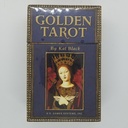
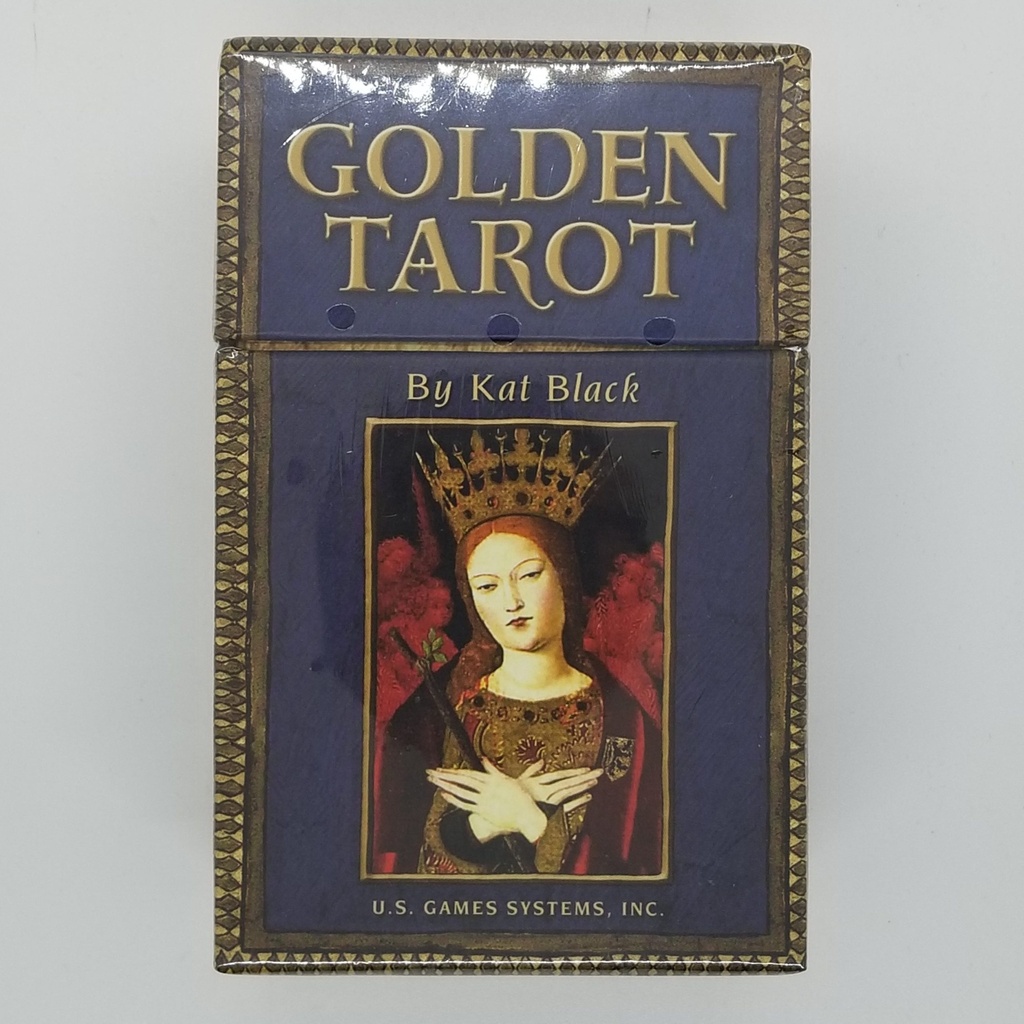
78 cards, 2.875" x 4.75", printed on stiff stock with a linen finish and gilded edges, packaged in a rigid telescoping box — a separate lid that slides down over the base rather than a flip-top. The companion volume is a genuinely bound book, not a stapled leaflet: 198 pages, trimmed to card size at 2.75" x 4.75", with black-and-white illustrations throughout. Total package weight runs around 1.3 lb, which is heavier than the box looks.
What you get
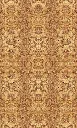
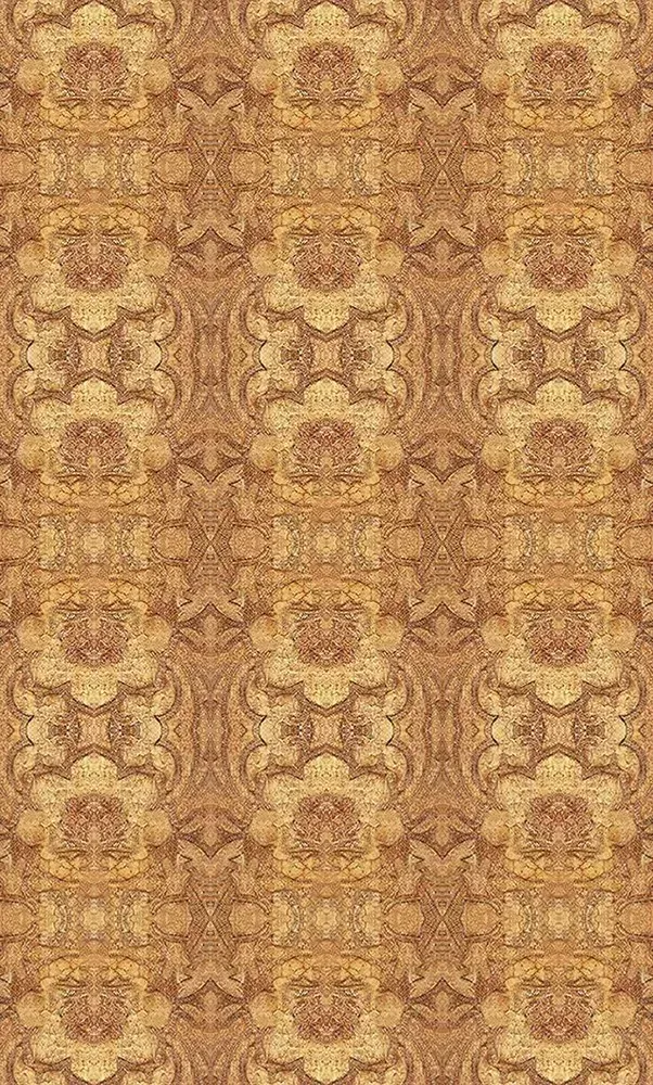
All 78 cards — 22 Major Arcana, 56 fully illustrated Minor Arcana with courts — plus a title card and a card carrying a note from Kat Black. Card backs print a repeating cream-and-tan pattern that reads identically either way up, so reversals stay hidden until you turn the card.
The book skips tarot fundamentals entirely and spends its length on four things: Black's account of how she built the deck, four spreads, upright and reversed interpretations for every card, and an appendix identifying the source artwork behind each image. That appendix is unusual and worth the shelf space on its own — it tells you which painting each fragment came from.
New decks stick to each other out of the box because of the gilt edging. This eases with handling and is normal for gilt-edge printing.
About the artwork
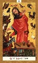
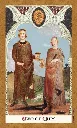
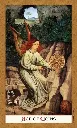
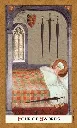
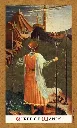
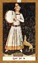
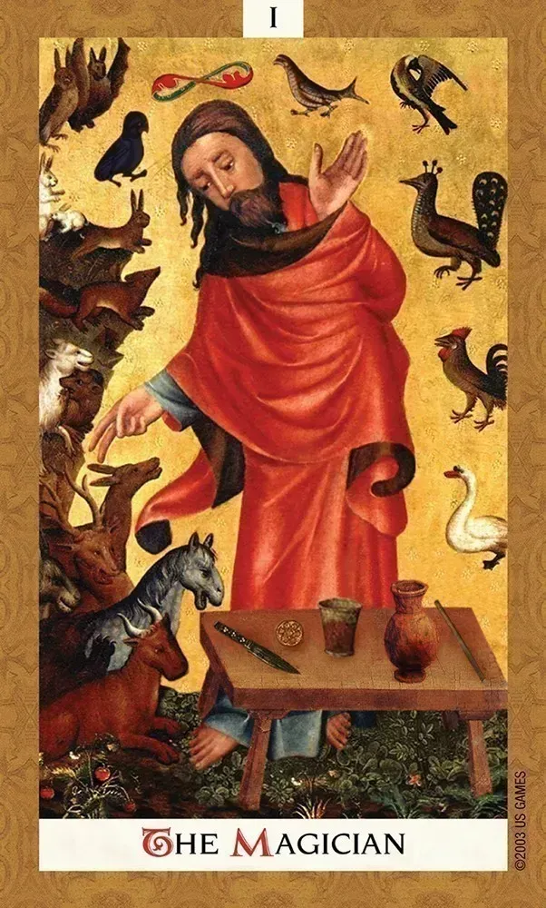
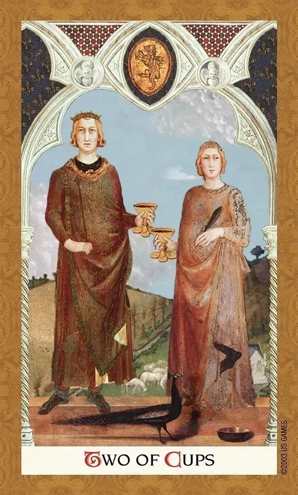
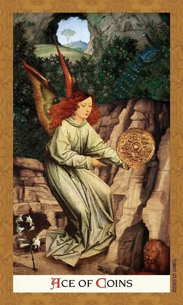
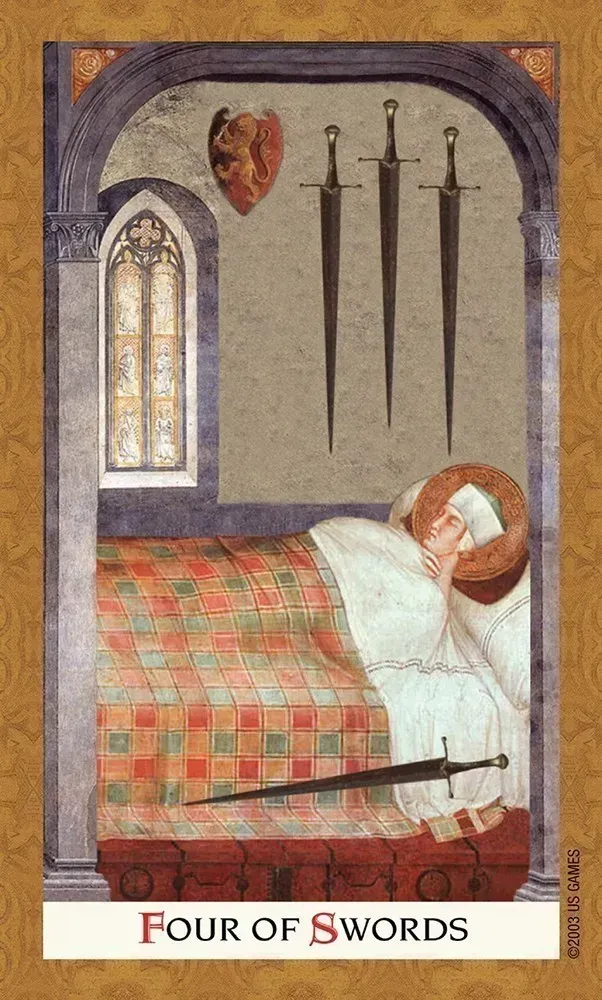
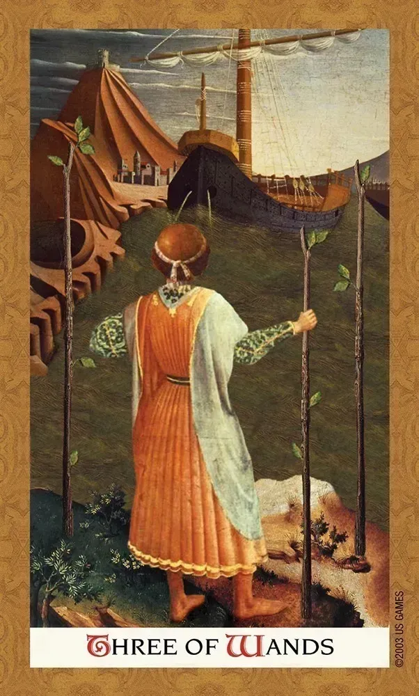
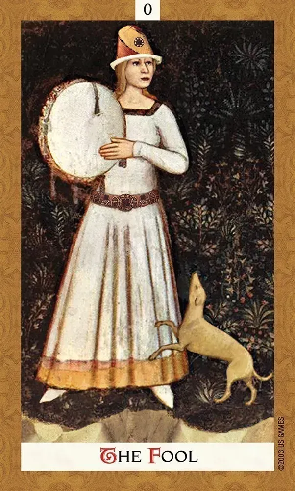
Every card is a digital collage assembled from photographs of existing paintings. Black worked from the period she calls International Gothic — roughly 1200 to 1500, the stretch that runs into the Renaissance — and deliberately avoided the famous names. No da Vinci, no Michelangelo. Most of the source paintings hang in European churches, which means a great deal of the imagery here has never circulated in the poster-and-postcard economy that made the canonical works familiar.
The compositing is seamless enough that plenty of readers work with the deck for a while before realizing it's collage at all. Faces, hands, drapery, and landscape from different centuries and different painters sit inside a single frame without visible seams, and each card carries a matte gold border.
Black's own stated reason for the source material: the period produced images of gentle beauty and human frailty out of conditions of violence and plague, and she reads that as hope surviving darkness.
Provenance & tradition
Structurally faithful to Rider-Waite-Smith, with the full 78 cards: standard Major sequence, four suits, sixteen courts, and Minor Arcana illustrated with scenes rather than bare pips — which is what makes an RWS-derived deck readable rather than merely decorative. Anything you learned from a standard tarot text applies here without adjustment. Black's written interpretations are her own, plainer and warmer than most esoteric tarot writing, but the symbolism underneath is Waite and Smith's.
Worth clearing up what "golden" refers to, since several unrelated decks share the word. Here it means the gilded card edges and the gold-ground painting tradition of the source art — the literal gold leaf that medieval and early Renaissance panel painters laid behind their figures. The cards are not foil-stamped, and this deck has no connection to the Lo Scarabeo titles that carry "Golden" in their names. The gilt is on the edge of the card block, visible when the deck is stacked.
Kat Black later produced Touchstone Tarot using the same collage method on Baroque paintings, a different period and a markedly different mood.
Who this is for
Readers who want a deck that looks like it belongs on an altar and reads like a working tool. Excellent for anyone drawn to medieval and pre-Reformation Christian imagery, art history, or the material culture of the period tarot itself emerged from. Suitable for beginners on the strength of the RWS fidelity, though the book assumes you already know what a Celtic Cross is. Strong choice for professional readers who want a deck that photographs well and impresses across a table. Reliable gift for collectors, and a common answer to "which deck is the most beautiful one you carry."